- Six free Google Font combinations, each matched to a design style — from timeless and minimal to moody and airy.
- The formula is simple: one heading font, one subheading font, one body font.
- Pick one combo and commit — use size and spacing for variety, and let your photography do the talking.
Fonts do the same job on your website that finishes do in a room. Most visitors won’t consciously notice them — but they’ll feel them. The right font pairing makes your site read as considered and professional before anyone reads a single word.
The good news: you don’t need to buy fonts to achieve this. Every combination below is free on Google Fonts, works beautifully in Showit, and is built the same way — one font for headings, one for subheadings, one for body text. Pick the combo that matches the feeling of your work, install all three, and you’re done.
Here are six free Google font combinations I’d happily use on a designer’s site tomorrow.
1. The Classic
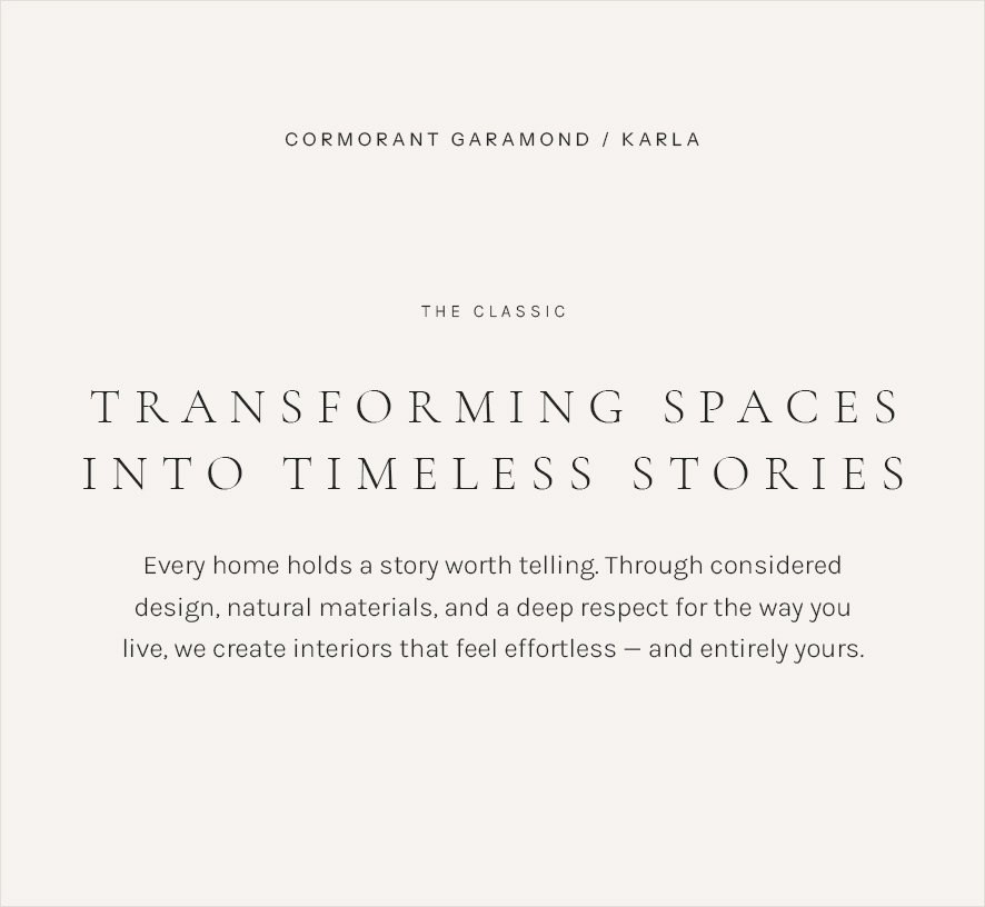
Headings: Cormorant Garamond · Subheadings: Karla · Body: Karla
Cormorant Garamond has the fine, high-contrast strokes you see in interiors magazines — elegant without being fussy. Karla in small, letter-spaced capitals gives your subheadings a clean gallery-label feel, and keeps paragraphs light and easy to read.
Best for: designers whose work leans timeless — layered, traditional-meets-modern spaces that photograph like editorial spreads.
2. The Modern Editorial
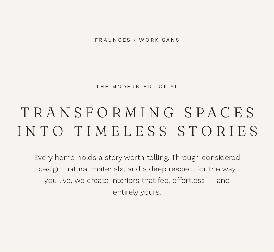
Headings: Fraunces · Subheadings: Work Sans · Body: Work Sans
Fraunces is a serif with personality — soft, slightly vintage curves that feel warm rather than stiff. Pairing it with Work Sans for everything else keeps the rest of the page quiet, so your titles (and your project photography) do the talking.
Best for: designers with a warm, characterful style — colour, curves, personality — who still want a polished, current-feeling site.
3. The Quiet Minimal
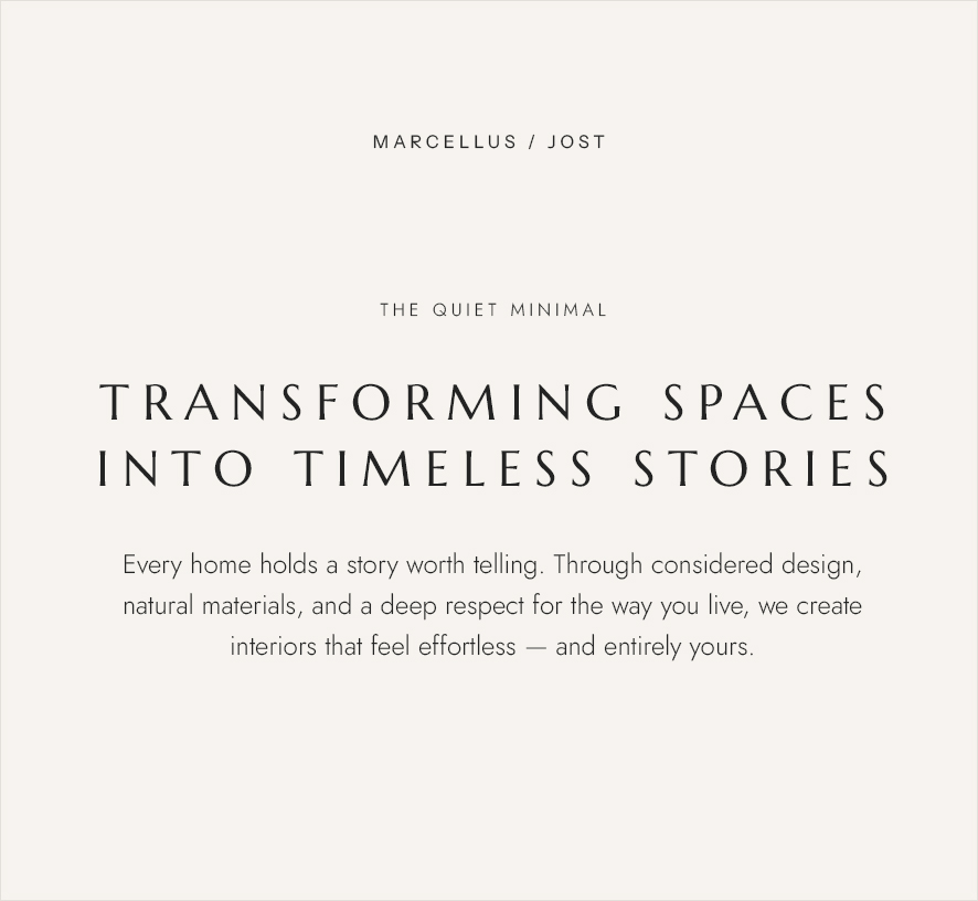
Headings: Marcellus · Subheadings: Jost · Body: Jost
Marcellus is a single-weight serif with classical proportions — think engraved lettering on a beautiful building. Jost is a clean geometric sans that stays out of the way. Together they create the kind of restraint that makes white space feel intentional.
Best for: minimalist designers. If your portfolio is calm, neutral and pared back, your fonts should be too.
4. The Warm Organic
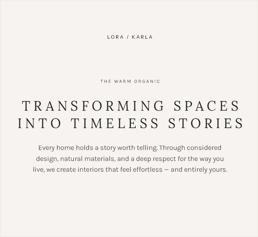
Headings: Lora · Subheadings: Karla · Body: Karla
Lora is a rounded, book-like serif that feels approachable and human. With Karla handling subheadings and body text, the whole site reads as friendly and unpretentious — the typographic equivalent of natural timber and linen.
Best for: designers whose work is soft, natural and liveable — family homes, coastal projects, anything where “welcoming” matters more than “dramatic”.
5. The Moody One
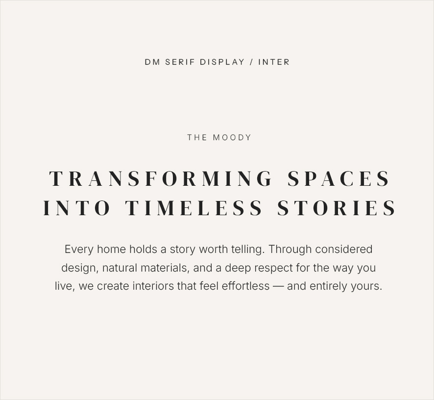
Headings: DM Serif Display · Subheadings: Inter · Body: Inter
DM Serif Display is bold and high-contrast — it holds its own against dark, dramatic photography instead of disappearing into it. Inter is one of the most readable sans-serifs ever made, which matters when your body text sits on deep charcoal or ink backgrounds.
Best for: designers working in richer, darker palettes — moody city apartments, hospitality projects, statement interiors.
6. The Airy Elegant
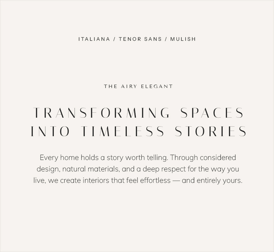
Headings: Italiana · Subheadings: Tenor Sans · Body: Mulish
Italiana is delicate and high-fashion — it looks hand-drawn by someone with very good taste. Tenor Sans continues that refined feel at subheading level, and Mulish keeps body text soft and legible. This is the lightest combination here, almost weightless.
Best for: designers with a luxe, understated aesthetic — think soft neutrals, marble, brass, and lots of breathing room.
Buttons
With buttons, I like to use the same font as the subheading – uppercase, spaced. Below is an example of how I style buttons. You can see a live demo of it right here in our Moss collection.
Font: Optician Sans
Font size: 11px
Font style: Uppercase
Letter spacing: 0.15em
Padding: top/bottom: 12px and left/right: 28px
- Pick one combo and commit. Mixing fonts from different combos is how sites start to feel busy. Three fonts, used consistently, is the whole trick.
- Use size and spacing, not more fonts, for variety. Big titles, small letter-spaced subheadings (capitals work beautifully here), comfortable body text around 15–16px.
- Let your photography lead. Your fonts should frame your projects, not compete with them. When in doubt, choose the quieter option.
Are you ready for a new website?
If you’re ready to put it all together, my post on how to launch a new website in a week walks you through the whole process.
See the Font Combos in the Live Collections →Pin this Post
Best Free Font Combinations for Interior Designers