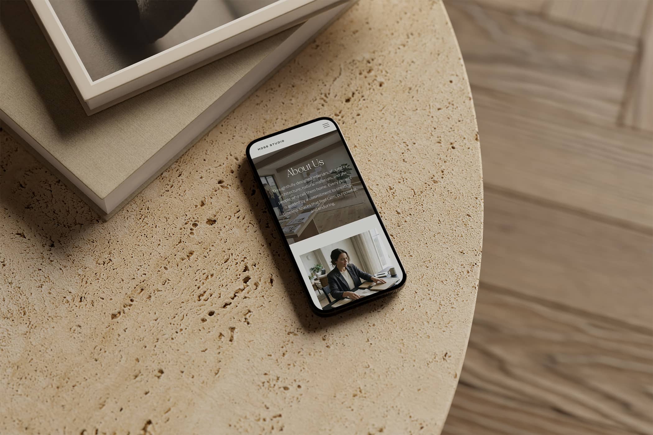
- More than half of your visitors arrive on their phones — and coming from Instagram and Pinterest, for designers it’s likely even more.
- Google ranks your mobile site first, so a clumsy mobile experience costs you clients and rankings at the same time.
- Most platforms simply shrink your desktop design; Showit lets you design mobile deliberately — which is why every Maeten Collection is designed mobile-first.
Open your site on your phone right now. Check these 3 things.
This is how most of your future clients will meet you, so it’s worth seeing what they see.
1. Can you read everything without pinching or zooming?
If you’re squinting at tiny text or your headings are breaking in awkward places, your visitors are too — and most will abandon immediately. Your words should be effortlessly readable at arm’s length, standing in a queue, one thumb on the screen.
2. Do your portfolio images actually show your work?
Images that look glorious on desktop can crop strangely on mobile — that beautiful wide shot of a living room suddenly becomes a warped vision of a lamp. Scroll through your pages and check that each image is showing as you intended.
3. Can someone enquire in one tap?
Imagine a potential client who’s ready to reach out. How many taps until they find your contact page — and once there, is the form easy to fill in with thumbs? If your enquiry button is buried in a menu or your form is fiddly, you’re making motivated people work too hard.
If your site failed even one of these, you’re not alone — and it’s rarely your fault. Most website platforms just shrink your desktop design down and call it a day. More on that in a moment.
Your clients are already on their phones
More than half of the world’s website traffic now comes from mobile devices (StatCounter), and for interior designers, the real number is almost certainly higher. Think about how your dream clients actually find you. They’re saving your work to a Pinterest board at 10pm. They’re tapping through from an Instagram story. They’re sending your profile to their partner with “what about her?” Every single one of those journeys starts on a phone — and if they tap through to your website, that’s where it continues.
Social traffic is the mobile-first-est traffic there is. A visitor arriving from Instagram or Pinterest has never seen your desktop site and may never see it. Their entire impression of your studio — your taste, your professionalism, your attention to detail — is formed on a screen the size of their hand. For a business built on visual judgement, that first impression carries real weight.
Google judges your mobile site first
It’s not just potential clients forming opinions on the small screen. With mobile-first indexing, Google predominantly uses the mobile version of your website for indexing and ranking. In plain English: when Google decides where you show up in search results, it’s looking at your mobile site — not the desktop version you’ve been polishing.
So a website that’s stunning on desktop but clumsy on mobile is quietly working against you twice: it’s underwhelming the visitors who do arrive, and it’s making it harder for new ones to find you via Google.
Why most platforms get this wrong and why I build on Showit
Most website platforms handle mobile with something called responsive design — your desktop layout automatically squashes and stacks itself to fit a smaller screen. It’s efficient, but you get very little say in the result. Elements pile on top of each other in an order you didn’t choose, spacing goes strange, and the considered composition you (or that ‘web designer’ you hired) built on desktop turns into an awkward scroll.
Showit takes a genuinely different approach: your mobile site is its own design. You can decide exactly what appears on mobile, in what order, at what size — completely independently of the desktop layout. Want a different hero image on mobile? Done. Want the enquiry button front and centre instead of three scrolls down? Easy. It’s one of the very few platforms that gives you this level of control.
This is exactly why every Maeten Collection is designed mobile-first. I don’t design a beautiful desktop site and then see what survives the shrink — the mobile experience is considered from the very beginning, because that’s where your future clients are already standing in their kitchens, imagining what you could do with theirs.
Ready for a website that works everywhere your clients are?
If your site didn’t pass the three-check test — or you’d simply rather not think about breakpoints ever again — the Maeten Collections are made for you. Each one is a complete Showit website designed specifically for interior designers, with a fully custom mobile design built in and prioritised from day one.
Explore the CollectionsWhy Your Interior Design Website Needs a Mobile Makeover